DESIGN LIKE AN ELITE GRAPHIC DESIGNER
The 18-Level Visual Training System for the 19-Year-Old Design Student
A personalized,, no-fluff,, business-ready guide to mastering mindset,, elements,, principles,, color,, typography,, layout,, logos,, branding,, posters,, thumbnails,, critique,, portfolio,, and daily practice without expensive software,, academic fog,, or waiting for permission. Built to be finished,, refined,, and used. From first sketch to final export,, this is your private design coach in book form.
DEDICATION
FOR You The 19-year-old graphic design student.
This is your studio manual.
Use it until the pages fall apart.
THE OPENING
Hey designer,,
I'm going to be your design coach. You're 19 and serious,, so I'll keep it direct. No fluff. No baby talk. No,, no,, no none of that.
Elite graphic designers aren't born with magic eyes. They train. They practice. They practice. They practice. They make ugly work,, diagnose it,, and fix it. That's the whole secret. That's it. That's the entire thing.
This guide is like a studio onboarding doc. Read one module,, do the exercise,, don't rush. If you do the work,, you'll start seeing like a designer. Seeing,, seeing,, seeing.
Quick truth: this is a compact field guide,, not a padded textbook. It has everything you need to start designing like an elite pro. Treat each chapter as a module. Come back and reread. The more exercises you finish,, the sharper your instinct gets.
Hmmmm. One more thing before we start.
Nobody becomes elite by reading. Not one person. Ever. You become elite by making,, breaking,, fixing,, and making again.
So. Ready?
Hell yeah. Let's go.
LEVEL 1: The Thing Nobody Tells You About Graphic Design
Graphic design is not just "making things pretty."
Nah. Not even close.
Graphic design is visual problem solving. Problem solving. Problem solving.
A client has a problem:
〉 "Nobody knows about my coffee cart."
〉 "My YouTube channel looks amateur."
〉 "My store needs a logo."
〉 "People can't read this poster."
A designer solves it with pictures,, words,, colors,, shapes,, and space.
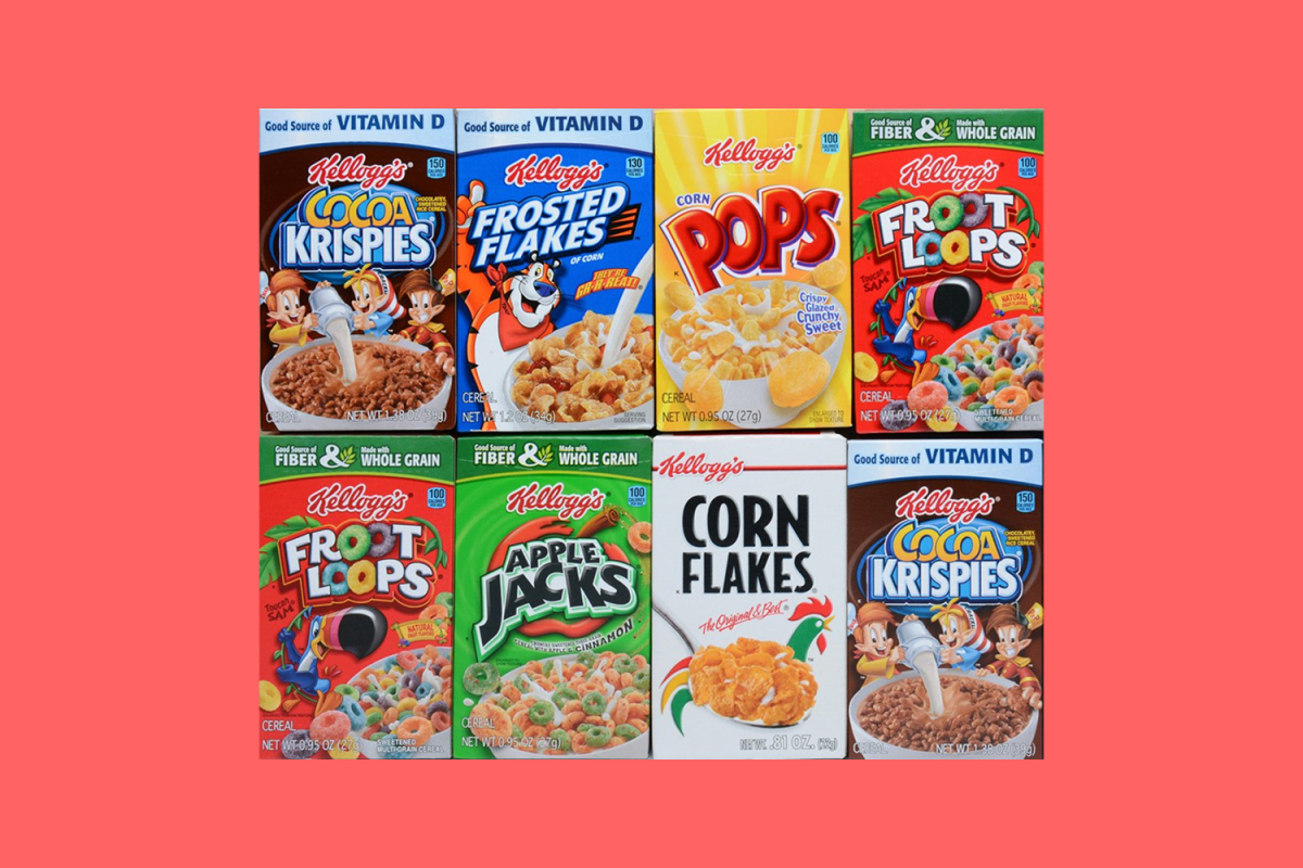
Think about a cereal box for a minute.
There Is Someone designed:
〉 The big logo
〉 The colors
〉 The cartoon mascot
〉 The words "NEW!" and "SUPER CRUNCHY"
〉 Where your eye goes first
〉 The back puzzles
〉 The tiny ingredients text
That's graphic design. It's everywhere: the apple logo of samsung or infinix logo on your phone & your mom & dad's phones. car logos like toyota or BMW,, the thumbnails of the videos you click on every day on youtube ,, the book covers,, the T-shirts,, the movie posters,, the footbal team jerseys,, all the app icons inside your phone & on your laptop,, the street signs,, an album art,, the restaurant menus,,
Everywhere. Everywhere.
Elite designers ask three questions. Every time. Every single time:
〉 Who is this for? A 5-year-old? A teenager? A grandma? A CEO?
〉 What should they feel? Excited? Calm? Hungry? Safe? Suspicious?
〉 What should they do? Buy it? Read it? Join it? Click it? Share it? & before all that, What is the product at all & what it can do for them?
If you don't know those answers,, you're just decorating or let's say you're making something that looks beutiful in your eyes that don't have bills & don't know what it means to design for a million dollar business . guess what, the designer who is not an artist and not a solver is simply a pleaser, & pleaser always are cheap & poor, anyway understand by yourself. so,, Design, is, a DECISION. A DECISIONS,, A SERIES OF DECISIONS.
Designers,, sOlVe,, sOLvE,, then SOLVE. who does not solve don't get money, even the POPULAR artist solve the problem of the rich who want to show his friends that he got a painting by BLUH BOLLY DAVINCI. but you? you solve only your chair.
EXERCISE 1
Find 10 designs around your home or online. or find 1 7abiby, find 1 kaka, & For each one,, answer:
〉 Who created this?
〉 Why did he/they created this?
〉 so that we huamans use or know what?
〉 &, What does it want me to feel by it's colors & shape?
〉 What does it want me to do? or know?
〉 What do I like about it?
〉 What is confusing?
〉 which parts of this could be simpler to use or easier to notice & read {texts shapes & colors & the organizing of those elements together inside this frame or space {paper/poster/book/t-shirt——whatever}?
Write these in a notebook. This notebook is your design brain. Your design brain. Guard it. Feed it. Fill it.
LEVEL 2: The Habits That Separate the Good From the GrEAT
Elite designers have minutely habits. the big ones,, ArE.
1. Curiosity
Elite designers notice everything. Everything. They look at signs,, packages,, fonts,, posters,, logos,, app buttons. They ask,, "Why did they do that? why they didn't do this?"
Why? Well,, because... somebody decided. a human chose that red. a human chose that smooth types. a human chose that spacing. And if a human chose it,, you can learn to choose it too.
2. Practice
Talent,, is the seeds. Practice is wattttter. You need,, lots offffffffffff praaaaa c tiiiii c e. Not one drawing. Not, one logo. 1 , 2 , 3 , 4 , 5 , 6, 7, 8, 9 , 10 , 11 , 12 , 13 ,14 , 15, 16 , 17 , 18 , 19 ,20, 21, 22, 23, 24 , 25, 26, 27, 28, 29 , 30 , 31 , 32 , 33 , 34 , 35 , 36 , 37 , 38 , 39 , 40 ,41 ,41 , 42 , 43 , , , 44 , 45 ,,,, 46 , 47 , 48 , 49 , 50 ,51 , , 52 , 53, 54, 55, 56 , 57, 58 , 59 , 60 , 61 , 62 , 63 , 64 , 65 , 66, 67 , , 68 69 70 71. /. 72 73 74 75 76 77 78 79 80 81 82 83 84 85 86 87 88 89 90 91 92 93 94 95 96 97 89 99 100. you see, there is 100 lessons for you & me,, just now. 999 of 1000 persons who once said they wanted to learn graphic design didn't learned it, why?, you know why. yeaAs YOU KnOw. because— they skipped reading the 100 numbers 👆 there just like you did. I'm not talking about reading By The Way :-|
3. Steal Like an Artist But Don't Copy
Bad designers copy. Good designers study. Great designers take an idea and remix it into something new {also they steal from some people who are in australia & there is 0% —chanco that someone here saw or will see that person's works,, {this was a secret but i told you hmmmmmm Ne O Problem}.
〉 Copying is "I'll make my logo exactly like Nike."
〉 Remixing is "Nike uses a simple swoosh. I'll make a simple shape that means speed for my running club."
See the difference? One is theft. One is learning or smart stealing.
4. Feeeed ck ba
Elite designers don't say,, "It's good because I made it & i must be good from the beggining yes yes i should aaaah 😭." That's stupidity,, stupidity,, stupidity.
They, THE EL EL ELITE 💪🏻 a s k "What's confusing? What can I make clearer? What's not working? What can I make clearer? What's confusing? WHY? What's not working? What can I make clearer? WHY?"
5. Finish
A finished ugly desi LLLEgn teaches more than a perfect idea in your head. Finish. Finish. Finish. Fi n. i i sh finish
6. Simplicity
If you can remove something and the design still works,, remove it. Simple is hard. Simple is powerful. Simple is simple. easy is good. easy is simple.
7. Constraints
Limits or let's say forcing yourself to focus on 3 things to make something btter than the things that made from 13 things { make you creative. Try designing a logo using only 3 shapes. Try a poster using only black,, white,, and red. Constraints,, are like levels in a game. Beat the level. Then beat a harder one. & after each level you know more tricks & bricks.
8. Audience
You're not designing for you YOU ARE not designing for you, you are not the one who will use it everyday, you, are not the one who must see it best, you, are not the one who should like it's colors or hpotos. you DONT exist. You are designing for the person who will see it. The person. The person. THAT person. NOT YOU, NOT EVEN THE FUCKING OWNER or his brother.
EXERCISE 2
Make 5 "bad" logos in 5 minutes. Seriously yes yes. Make them silly,, messy,, ugly,, nonsense,, silly 🤪. This teaches you that bad ideas are part of the path. Don't erase. don't erase, don't. Just, draw. DRAAAW. Draw fffff—ast. Draw ugG G Gly.
LEVEL 3: The 7UP 🟢🍹 Ingredients Every Designer Must Master
These are your ingredients,, like in Minecraft crafting.
1. Line { — | }
Lines guide your eye. They can be straight,, curved,, thick,, thin,, smooth,, jagged. Lines show direction,, energy,, connection.
2. Shape { ⏺ | ⏹ | ▼ | ✦ | ❤ | 𑗊 | ⟆ | ⏺ 👈🏻😂 }
Shapes are areas with borders. Circles feel ⏺ friendly. Squares ⏹ feel stable. Triangles ▼ feel energetic or dangerous. Org𑗊nic shapes feel natural.
3. Color
Color creates mood. Red feels LOUD. Blue feels calm. Yellow feels happy. Black feels fancy or powerful. pink feels girly {kchana} — & and
green feels clean air foooo 😮💨 fe———w.
{EVEN THOUGH FOR EACH PERSON THE FEELING OF EACH COLOR MAYBE DIFFERENT BUT IN GENERAL MOST OF HUAMNS FEEL THE SAME ABOUT THE BASIC COLORS {RED “ GREE ” BLUE} yeah? all see red danegoures because we see it rarely, & mostly we see it in blood & killings. so our brain associate them with that {branding}
same for green we feel {grass | 🌲 trees} trees when we see them in other things,
you undertood the logic? yeh? ok. so i'll not talk about the other ciolers ciooler 😂
4. Texture
Texture,, is,, how something looks like it would feel. Rough,, smooth,, fuZZIIzy,, shin ey,, pape er,, me t t ttal,, wwaterr.
5. Space
Space,, is,,, ISSSS,, the empty area around and between things. Beginners fill every gap.
Pros use space to make things breathe. Breathe. B R E A T H E E.
6. Form
Form is 3D shape. In 2D design,, shadows and highlights can make something look 3D. Hard to explain sorry 🙏🏻 in next version i will ♻️ it better
7. Typography
Typography is the art of words. Font choice,, size,, spacing,, placement. Words are design too,, Not just decors. {ahh, someday you'll understand}
OK NOW ↓
EXERCISE 3
Draw a page using only:
〉 5 lines
〉 3 circles
〉 2 triangles
〉 1 square
No words. Can you make it feel fast? Can YOU? make it,, Calm? Dangerous? Happy? Try all four. Same shapes,, f4ur moods.
LEVEL 4: The 🎱 Rules That Make or Break Every Layout
Elements are ingredients. Principles are the recipe.
Elements ARE ingredients. Principles ARE
WHAT? THE WHOLE RECIPE.
1. Contrast
Contrast makes things different so they stand out. so easy,,
Contrast makes things different so they stand out. OUT,, OuT,, A litole oUt.
BIG vs. small. Grey vs. white. BOLD vs. thin. If everything is the same,, nothing stands out. Nothing. If,, everything,, is,, the same,, what? 👂🏻🤷🏻♂️?
nothingstands}out.
AlignmenT
Alignment means things line up. When words and pictures line up,, the design feels clean. When they float randomly,, it feels messy. Messy,, messy,, Messy. ANKARA pessi
3. Repetition
Repeat Colors shapes,, fonts,, styles. Repetition makes a design feel connected,, like a family. Repeat Colors + OOOrrrdddeeerrr + PoS IsH IoN
4. Proximity
Things close together seem related. Put a title near its 🌁 picture. Put un relat -ed thin g s,, f ar a pa -rt.
5. Hierarchy
Hierarchy is order of importance.
What should people see first 👆,, second,, sthird?
Use size,, color,,
and place— —ment to show— it.—
6. baLANce
Balance is visual weight. A big dark shape on one side can be balanced by a small bright shape on the other like this 🌚🌞. Or use symmetry,, like a butterfly 🦋.
7. Movement
M-o—v-e—m-e—n-t ,, guides the eye 👁️. Arrows,, —— lines ——,, faces looking in a direction 🤥👉🏻🗿,, repeated shapes all pull your eye across the page.
8. W h i t e S p a c e
White space is emp y space. It's not wasted. It's like silence in music. It makes the important stuff LOOOUUUDDDEEER. LOUDER. LouDER.
EXERCISE FO R
Take a campus flyer,, event invitation,, or YouTube thumbnail. Redesign it using these 8 principles. Make the title HHUUGGEE. Line things up |||. Add emp y space. Remove 2 things. Then remove 3 mo e.
LEVEL 5: How Color Cont ols What People Fe?el,, Be[ore They R d a Word
Color is emotion. It's also science. Both. Always both
Color Basics
〉 Primary colors: red,, blue,, yellow
〉 Secondary colors: green,, orange,, purple
〉 Tertiary colors: mix primary and secondary,, like blue-green
〉 Hue ### = the color name
〉 Saturation = how bright or gray a color is
〉 Value = how light or dark a color is
Color Moods {MAY CHANGE BASED ON EACH HUMNA—DON'T MISS}
〉 Red: energy,, danger,, love,, food,, excitement
〉 Blue: trust,, calm,, technology,, water,, sadness
〉 Yellow: happiness,, warning,, sunshine,, attention
〉 Green: nature,, health,, money,, growth
〉 Purple: royalty,, magic,, creativity,, mystery
〉 Orange: fun,, friendly,, energetic,, cheap
〉 Black: power,, luxury,, mystery,, elegance
〉 White: clean,, simple,, pure,, space
〉 Pink: playful,, sweet,, romantic,, bold
〉 Brown: earthy,, warm,, old,, natural
Palettes
A palette is a team of colors. A team . A teAm .
〉 Complementary = opposite colors on the wheel. Red + green. Blue + orange. High CON_rast.
〉 Analogous: neighbors on the wheel. Blue,, blue-green,, green. Calm and harmonious.
〉 Monochrome: one color with different lights & darks.
〉 60-30-10 rule: 60% main color,, 30% second color,, 10% accent color. The accent pops.
Accessibility
Not everyone sees color the same. Some people are colorblind. Don't use color alone to show meaning. Add words,, shapes,, or icons. Also make sure text has strong contrast with the background. Dark text on light background,, or light text on dark background. No exceptions. None.
EXERCISE 5
Make 3 color palettes:
〉 Candy brand: fun,, sweet,, loud
〉 Robot company: smart,, cool,, trustworthy
〉 Calm app: peaceful,, soft,, simple
Use only 4 colors each. Name each palette.
LEVEL 6: Why Typography Is 90% of Design (and Nobody Told You)
Typography can make a design feel expensive,, silly,, scary,, friendly,, or professional. One font change. One. And everything shifts.
Font Types
〉 Serif: has little feet. Like Times New Roman. Feels traditional,, bookish,, classic.
〉 Sans-serif: no feet. Like Arial,, Helvetica,, Roboto. Feels clean,, modern,, simple.
〉 Script: looks handwritten. Feels fancy,, personal,, elegant.
〉 Display: big,, bold,, decorative. Used for titles. Not for long text.
〉 Monospace: every letter same width. Feels techy,, code-like.
Font Pairing
Beginners use too many fonts. Elite designers use 1 2 fonts. Sometimes 3 max.
Easy pairing:
〉 One bold display font for the title
〉 One simple sans-serif for the body text
Example:
〉 Title: Bebas Neue
〉 Body: Open Sans
That's it. That's the whole trick.
Hierarchy in Type
Make people read in order:
〉 Biggest,, boldest: title
〉 Medium: subtitle
〉 Smallest: details
Spacing Words
〉 Kerning: space between individual letters
〉 Tracking: space between all letters
〉 Leading: space between lines of text
If letters are too tight,, it's hard to read. If too loose,, it falls apart. Falls apart. Falls apart.
EXERCISE 6
Write your name 10 different ways:
〉 Big and bold
〉 Tiny and elegant
〉 All caps
〉 Lowercase
〉 With wide spacing
〉 With tight spacing
〉 Using only circles
〉 Using only straight lines
〉 Like a superhero logo
〉 Like a candy wrapper
Ten versions. Same name. Different souls.
LEVEL 7: The Invisible Grid That Makes Everything Look Intentional
Layout is where things go. Elite designers don't just guess. They use grids.
The Grid
A grid is invisible lines that organize the page.
〉 Margins: empty space around the edges
〉 Columns: vertical sections
〉 Rows: horizontal sections
〉 Gutters: space between columns
A simple grid:
〉 3 columns
〉 1 margin around the edge
〉 Title across the top
〉 Image in one column
〉 Text in another
Rule of Thirds
Imagine your page divided into 3 columns and 3 rows. Put important things on the lines or where lines cross. It feels balanced and interesting.
Focal Point
Every design needs one main thing your eye sees first. One. That's the focal point. Make it biggest,, brightest,, or most different.
Z-Pattern and F-Pattern
〉 Z-pattern: eye goes left to right,, down,, left to right. Good for simple posters.
〉 F-pattern: eye scans top,, then down the left side. Good for websites and text-heavy layouts.
White Space
Empty space is not empty. It's a design tool. It makes things feel premium and clear. Premium and clear.
EXERCISE 7
Take a messy flyer. Rebuild it on a 3-column grid. Align everything. Add margins. Make one focal point. Remove clutter. All the clutter. Gone.
LEVEL 8: How to Design a Logo That Works Small,, Big,, and Forever
A logo is a tiny picture that stands for a brand. It should be simple,, memorable,, and work small.
Logo Types
〉 Wordmark: just the name. Google,, Coca-Cola.
〉 Lettermark: initials. HBO,, NASA.
〉 Pictorial: a picture. Apple,, Twitter bird.
〉 Abstract: shapes that suggest a feeling. Nike swoosh.
〉 Mascot: a character. KFC Colonel,, Pringles man.
〉 Emblem: text inside a badge. Starbucks,, football crests.
〉 Combination: word + symbol. Burger King,, Lacoste.
Logo Process
〉 Research: What is the brand? Who is it for?
〉 Sketch 50 ideas. Yes,, 50. Fast and messy.
〉 Pick 5. Improve them.
〉 Make them black and white first. If it works without color,, it works.
〉 Test small: does it work as an app icon?
〉 Test big: does it work on a poster?
〉 Vectorize it in Inkscape,, Figma,, or Adobe Illustrator.
〉 Add color last. Last. Always last.
Logo Rules
〉 Simple beats complicated.
〉 Memorable beats clever.
〉 Timeless beats trendy.
〉 Works in one color.
〉 Works at tiny size.
〉 Don't use too many details.
〉 Don't copy.
Simple. Memorable. Timeless. Three words. Tattoo them on your brain.
EXERCISE 8
Design a logo for an imaginary club:
〉 Nightshift Coffee Cart
〉 Concrete Waves Skate Co.
〉 Independent Pizza Brand
Sketch 50 thumbnails. Pick 5. Finish 1 in black and white. Then add color.
LEVEL 9: What a Brand Really Is (Hint: It's Not Just a Logo)
A logo is not a brand. A brand is the whole feeling. The whole feeling. The whole feeling.
Brand includes:
〉 Logo
〉 Colors
〉 Fonts
〉 Shapes
〉 Photos
〉 Tone of voice
〉 Rules
Example: a coffee cart brand.
〉 Logo: smiling cup with sunglasses
〉 Colors: warm brown,, cream,, deep teal
〉 Font: rounded,, friendly
〉 Voice: "Fresh. Fast. No nonsense."
〉 Shapes: circles and drops
〉 Photos: steam,, hands,, early morning light
A brand board shows all these together:
〉 Logo
〉 Color palette
〉 Fonts
〉 3 words that describe the brand
〉 Patterns or shapes
EXERCISE 9
Create a brand board for a coffee cart. Include:
〉 Name
〉 Logo
〉 4 colors
〉 2 fonts
〉 3 brand words
〉 A pattern
〉 A tagline
LEVEL 10: How to Grab Attention in Three Seconds or Less
These are designs that need to grab attention fast. Fast. Fast.
Poster Rules
〉 One big message
〉 One main image or shape
〉 Big title
〉 Clear details: when,, where,, who
〉 Strong contrast
〉 Readable from far away
YouTube Thumbnail Rules
〉 Face with emotion
〉 3 5 words max
〉 Bright contrast
〉 Simple background
〉 One clear focal point
〉 Don't cram
Social Media Post Rules
〉 Square or vertical
〉 Big text
〉 Brand colors
〉 One idea per post
〉 Leave space for logo
EXERCISE 10
Make:
〉 A movie poster for a movie called "The Last Pencil"
〉 A YouTube thumbnail for "I Built a Studio from Cardboard"
〉 A social post for a campus bake sale
Use only 2 fonts and 3 colors.
LEVEL 11: The Only Tools You Actually Need (and They're Free)
You don't need expensive tools. You need practice. Practice. Practice.
Free Tools
〉 Paper and pencil: the best start. Always.
〉 Canva: easy templates,, drag and drop. Great for beginners.
〉 Figma: professional free tool. Learn frames,, shapes,, text,, alignment.
〉 Photopea: free Photoshop-like tool in browser.
〉 GIMP: free image editor.
〉 Inkscape: free vector tool for logos.
〉 Krita: free drawing and painting.
〉 Google Fonts: free fonts.
〉 Coolors: color palettes.
〉 Adobe Color: color wheel and palettes.
〉 Unsplash / Pexels: free photos. Check rules.
〉 Google Drawings / Slides: simple layout practice.
Check terms,, licenses,, and account security. Protect your personal data and client confidentiality.
Keyboard Shortcuts to Learn
〉 Ctrl/Cmd + Z = undo
〉 Ctrl/Cmd + C = copy
〉 Ctrl/Cmd + V = paste
〉 Ctrl/Cmd + D = duplicate
〉 Ctrl/Cmd + G = group
〉 Ctrl/Cmd + Shift + G = ungroup
〉 Ctrl/Cmd + + / = zoom
〉 Spacebar = pan
〉 V = move tool in many apps
〉 T = text tool
〉 R = rectangle
〉 O = ellipse
Learn these until your fingers know them without you. Muscle memory. Muscle memory.
EXERCISE 11
Open Canva or Figma. Recreate a simple poster you like. Don't use the template. Build it yourself using shapes,, text,, and colors.
LEVEL 12: The Process That Stops You From Guessing
Elite designers follow a process. It stops you from just guessing.
Step 1: Brief
What is the project? Who is it for? What should it do?
Example: "Design a poster for a campus talent showcase. Audience: students and staff. Goal: make them excited to come."
Step 2: Research
Look at 10 similar designs. Save the best. Ask why they work.
Step 3: Mood Board
Collect colors,, fonts,, photos,, shapes that feel right. Put them on one page.
Step 4: Thumbnails
Draw 20 tiny rough ideas. Fast. No detail.
Step 5: Wireframe
Make a simple layout with boxes. No color. No fancy fonts. Just where things go.
Step 6: First Draft
Build it. Use your grid. Use your palette. Use your fonts.
Step 7: Feedback
Ask 3 people:
〉 What do you see first?
〉 What is confusing?
〉 What would you change?
Step 8: Refine
Fix the problems. Simplify. Align. Increase contrast.
Step 9: Final
Export as PNG or PDF. Check it on phone and computer. Make sure text is readable.
EXERCISE 12
Do the full process for a poster for "The Great Paper Airplane Contest." Don't skip thumbnails. Don't skip. Don't.
LEVEL 13: Thirty Days to Rewire Your Design Brain
Do one small thing every day. 15 30 minutes. That's it. That's the whole ask.
〉 1. Collect 5 designs you like. Write why.
〉 2. Draw 20 circles. Make each one feel different.
〉 3. Make a color palette for a superhero.
〉 4. Type your name in 5 fonts.
〉 5. Design a logo for a pencil.
〉 6. Redesign a cereal box in one color.
〉 7. Make a poster with only black and white.
〉 8. Create a mood board for a space movie.
〉 9. Draw 10 logo thumbnails for a pet shop.
〉 10. Learn one new tool shortcut.
〉 11. Make a YouTube thumbnail for a video you'd watch.
〉 12. Design a business card for a consultant.
〉 13. Make a pattern using only triangles.
〉 14. Redesign a campus notice.
〉 15. Create a brand board for a smoothie shop.
〉 16. Draw a logo using only circles.
〉 17. Make a poster for an underground music event.
〉 18. Design an app icon for a productivity app.
〉 19. Make a color palette from a photo.
〉 20. Copy a master design by recreating it. Don't share it. Learn from it.
〉 21. Design a T-shirt for your favorite hobby.
〉 22. Make a book cover for your favorite story.
〉 23. Create a poster with no images,, only type.
〉 24. Design a mascot for a tech club.
〉 25. Make a social post for a lost dog.
〉 26. Redesign a menu for a pizza brand.
〉 27. Create a logo for your own future company.
〉 28. Make a poster using only 3 shapes.
〉 29. Ask someone for feedback. Fix one thing.
〉 30. Pick your best 3 projects. Put them in a folder.
Thirty days. Thirty small wins. Small wins. Small wins.
LEVEL 14: How to Critique Without Being a Jerk or a Doormat
Critique is not saying "I like it" or "I hate it." That's not critique. That's noise.
Critique is solving problems.
Ask:
〉 What is the first thing I see?
〉 Is that the most important thing?
〉 Is the text readable?
〉 Is the contrast strong enough?
〉 Is it aligned?
〉 Is there too much stuff?
〉 Does it fit the audience?
〉 Does it work in black and white?
〉 Does it work small?
Tricks to Test Your Design
〉 Squint test: Squint. What stands out? That's your hierarchy.
〉 Flip test: Flip it upside down. Alignment problems show up.
〉 Grayscale test: Remove color. Does it still work?
〉 Shrink test: Make it tiny. Can you still read the main idea?
〉 Distance test: Step 5 feet away. What do you see?
Five tests. Five. Run them all before you call anything finished.
EXERCISE 14
Take your best poster. Do all 5 tests. Write down 3 problems. Fix them.
LEVEL 15: How to Build a Portfolio That Gets You Hired
A portfolio is a collection of your best work. You don't need 100 pieces. You need 5 10 great ones. Great ones. Great ones.
For each project,, show:
〉 The problem
〉 Your sketches
〉 Your first draft
〉 Feedback
〉 Final design
〉 What you learned
This is called a case study. It shows how you think,, not just what you made. How you think. That's the part that gets you hired.
Places to keep a portfolio:
〉 A folder on your computer
〉 A simple website
〉 A PDF you can email
〉 A printed book
Never share your address,, phone number,, or client confidential info online.
EXERCISE 15
Pick your 5 best projects. Write 3 sentences for each:
〉 What was the goal?
〉 What did I make?
〉 What did I learn?
LEVEL 16: The Daily Habits That Make You Better Fast
1. Keep a Swipe File
Save designs you love. Organize them: logos,, posters,, fonts,, colors. Don't copy. Study. Study. Study.
2. Carry a Sketchbook
Ideas disappear. Draw them fast.
3. Study One Tool at a Time
Don't try to learn everything. This week: alignment. Next week: color. Next week: typography.
4. Recreate Master Designs
Pick a famous poster or logo. Rebuild it. You'll learn more than watching 100 videos.
5. Finish Bad Work
A finished bad project is a level up. An unfinished perfect idea is nothing. Nothing. Nothing.
6. Rest Your Eyes
Look at something far away for 20 seconds. Blink. Design is tiring.
7. Ask "Why?"
Every time you see a design,, ask why. Why red? Why that font? Why so much space?
8. Teach Someone
Teach a friend one thing you learned. Teaching proves you know it.
9. Be Kind to Yourself
Your first designs will not look like a pro's. That's normal. Pros have years of practice. You're level 1. Keep playing.
10. Design Every Day
15 minutes a day beats 3 hours once a month. Every time. Every. Single. Time.
LEVEL 17: Your First Real Project From Start to Finish
Let's put it all together.
Project: Design a brand for a small business.
Pick one:
〉 A dog-walking service
〉 A cupcake shop
〉 A video game channel
〉 A skateboard brand
〉 A magic kit company
Do this:
〉 Write a brief: Who is it for? What feeling? What action?
〉 Research 10 designs.
〉 Make a mood board.
〉 Sketch 50 logo thumbnails.
〉 Pick 5. Refine.
〉 Choose 2 fonts.
〉 Choose 4 colors.
〉 Make a logo in black and white.
〉 Add color.
〉 Design a business card.
〉 Design a poster.
〉 Design a social media post.
〉 Make a brand board.
〉 Ask for feedback.
〉 Fix it.
〉 Put it in your portfolio.
That one project will teach you more than 100 random drawings. One project. Real work. Real learning.
LEVEL 18: The Mind Behind the Designer
Elite designers are not just good at making things. They are good at thinking. Thinking. Thinking.
They:
〉 Listen
〉 Ask questions
〉 Solve problems
〉 Simplify
〉 Practice
〉 Accept feedback
〉 Finish
〉 Keep learning
〉 Help others
〉 Stay curious
You don't need to be a grown-up with a corner office. You need to start. Start. Start.
YOUR FINAL PEP TALK
You're 19. That's an advantage.
If you practice design for 15 minutes a day,, by the time you're 24,, you'll have 5 years of experience. Five years. That's more than many graduates.
Don't wait for the perfect computer or the perfect app. Start with paper. Start with bad drawings. Start with one logo. Start today.
Remember:
Simple is strong.
Contrast is king.
Alignment is free polish.
White space is not wasted.
Type is design.
Color is emotion.
Feedback is a gift.
Finished beats perfect.
Practice beats talent.
Your dream is real. You just have to build it one small design at a time.
Now go make something. Then make it better. Then make it again.
You've got this. Now go design.
SKIP DESIGN SCHOOL.


